

FRINGE
How do you create a hyper-niche brand in an extremely busy category?
Challenge
Founder Hunter Schaeffer came to us with a delicious proposition: an on-the-go protein bar packed with adaptogens to help support the mind and body. But how could we stand out in the extremely crowded protein bar category? It seems every brand is targeting the active outdoorsman, and with such a small graphic footprint, the brand had to have an extremely differentiated look, feel, and tone of voice to capture shopper’s attention.
Insights & Strategy
Does the world need another protein bar targeting the free solo mountain climber? No. But, we did see an opportunity to go deep into an untapped niche: surfers. Hunter himself is a part of this vibrant community, so we set to work learning all we could. We did a deep dive into surf culture to create a brand voice that resonates meaningfully with the surf community. A competitive landscape review made it clear that the other protein bar brands have jumped on the minimalist train (love it, no shade), so to differentiate, we would have to go the opposite route fearlessly.
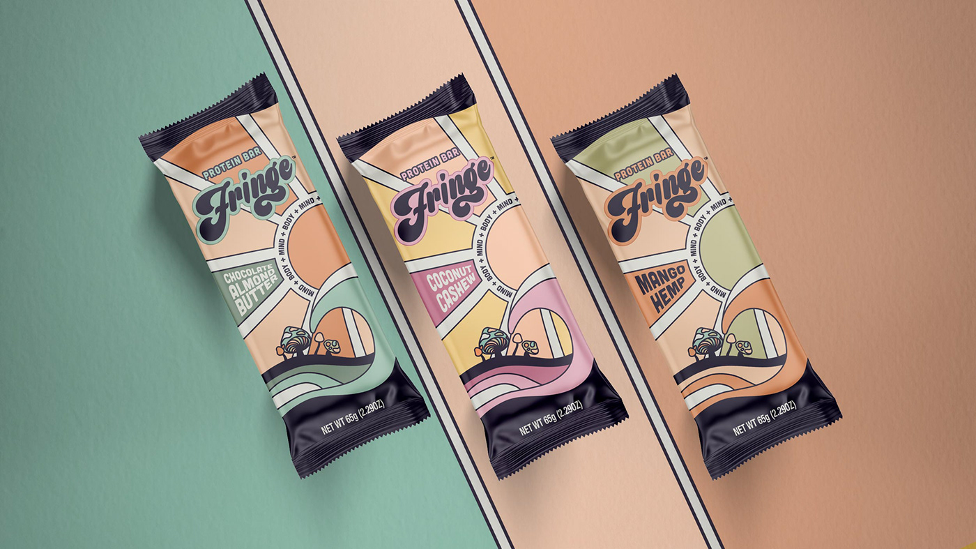
Solution
In the current ultra-minimalist packaging environment, Fringe is a maximalist, nostalgic celebration of surf culture–in its own modern voice. Hand-drawn illustrations, a super chill color palette, and feel-good typography bring the mind-body connection to the forefront of the brand.
Fringe is a love letter to the surf community–full of real food and adaptogens that fuel the body and mind–wrapped in nostalgia and good vibes.


